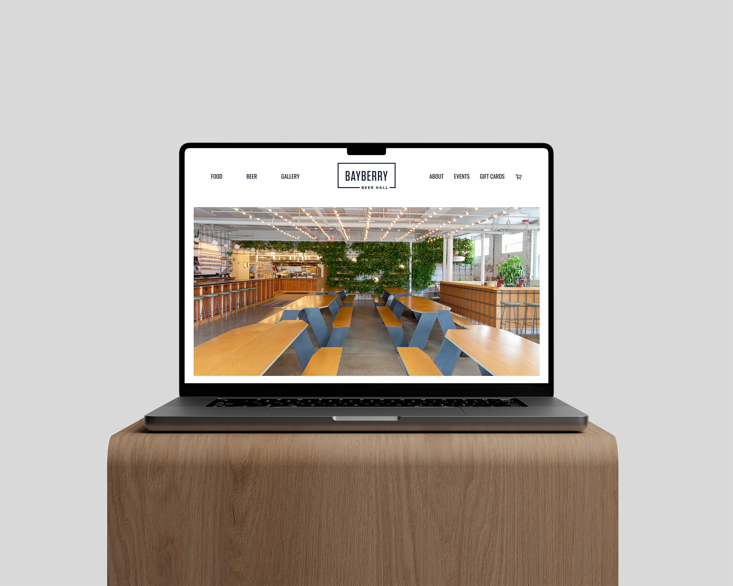
When new ownership took over Bruce & Bruce and began modernizing one of America's founding actuarial consulting firms, they needed a Brand Identity System worthy of the institution. Caol delivered a complete system spanning logo, stationery, conference materials, client-facing documents, a Webflow website, and email design. When it landed, the people inside the firm felt it immediately.
Bruce & Bruce has been measuring risk since 1929. That kind of history earns a certain authority in a room, but for decades the visual identity hadn't kept pace with the institution behind it. When new ownership took over in 2018 and began the work of modernizing and expanding the firm, the brand was one of the first things that needed to catch up. Silvio Rodia, stepping into the role of Vice President, understood that a firm with nearly a century of industry leadership deserved to look like it.
Internal attempts at a refresh had already been made before Caol came in. They were soft, inconclusive, and hadn't landed anywhere meaningful. What the firm needed was an outside creative perspective with real authority on how brand systems create structural change in the way a business operates and is perceived. Caol worked closely with Silvio and the firm's team of actuaries, who were simultaneously developing a new mission statement and collaborating on updated marketing strategies, to make sure the identity that emerged was rooted in something true about the company rather than imposed on top of it.
The centerpiece of the new identity is the BB monogram. Harley Bruce founded this firm alone in 1929, but it became Bruce & Bruce the moment his sons Robert and William joined him, two brothers whose names the company has carried ever since. That duality deserved to live in the mark itself. Caol designed two interlocking uppercase B characters, custom lettered to achieve precise optical balance between the forms, the counters tuned carefully so the two characters read as one unified mark without either letterform losing its integrity. The inspiration came from legacy rebrands like Rolls Royce and Warner Brothers, identities that modernized without abandoning the weight of their history. The result is a mark that feels institutional and considered, the kind of thing you'd expect to see on a boardroom wall or embossed on a folder, and feel the weight of immediately.
The palette built around it is just as considered. A deep aged navy anchors the system with the gravitas the firm's history demands, paired with a vibrant cyan that brings energy and forward momentum, a digital blue for versatility across screens, and a warm dandelion yellow that keeps the whole thing from feeling cold. Avenir was selected as the supporting typeface, geometric, clean, widely accessible across office systems, and professional without being stiff. Unbeknownst to Caol during the color development, Silvio's wife, a design specialist, had chosen nearly the same colors for the office interiors years earlier. It got a laugh, and settled any remaining questions about the direction.
The identity didn't stop at the logo. It extended into everything the firm touches, a full stationery system, conference materials, branded digital surfaces, and client-facing documents including data tables and reporting materials rebuilt with the same visual precision Bruce & Bruce had always brought to the numbers themselves. A new Webflow website and considered email design rounded out the system, giving the firm a consistent, professional identity for a confident, outward facing presence.
What came back after the work landed wasn't a metric. It was something harder to manufacture and more useful to have. The people at Bruce & Bruce carried themselves differently. They handed over business cards with confidence, pulled up the website in meetings without hesitation, and felt for the first time that their name looked as substantial on paper as it did in practice. After nearly a century of industry leadership, Bruce & Bruce finally had a Brand Identity, a website, and a complete suite of materials worthy of the institution it had always been.
After nearly a century of industry leadership, Bruce & Bruce finally had a Brand Identity, a website, and a complete suite of materials worthy of the institution it had always been.
Whether you’re pitching to investors or sharing impact with donors, intentional design helps you be seen, heard, and supported.