Riverzedge Arts is a youth-led creative nonprofit that had been doing meaningful work in the community for years, but its visual identity hadn't kept pace. Caol led a small collaborative team through a full Brand Identity refresh and initial Website Design, modernizing a dated system into a scalable, fully realized visual language that gave the organization the outward presence it had always deserved.
Riverzedge Arts had been doing meaningful work in the community for years, but its visual identity wasn't keeping up. The existing brand was a product of its era, built around poppy oranges and white, a minimal palette that simply didn't have enough to work as a system and fell apart anywhere it needed to do more. The logotype was set in a free font from DaFont with nothing else holding it together. For an organization doing serious creative work with young people, the brand wasn't reflecting what was actually happening inside the building.
Caol was brought in as a junior designer and tasked with leading a small team through a full rebrand of the Rhode Island nonprofit. Working closely with collaborators Abigail Shobajo and Bountheng Tanakhone, whose creative instincts and input shaped the direction throughout, the team modernized the identity from the ground up. The logotype was retained as a reference point but thoroughly rebuilt, reset in typefaces sourced from reputable type foundries and supported by a modernized color palette and a more deliberate use of shape and structure. Multiple lockups were developed at different scales and configurations, each designed to perform in a specific context: social media, marketing materials, web, and print. The result was a cohesive Brand Identity System designed from the start to scale.
The new identity rolled out across a full range of collateral including business cards, signage, postcards, and event materials.
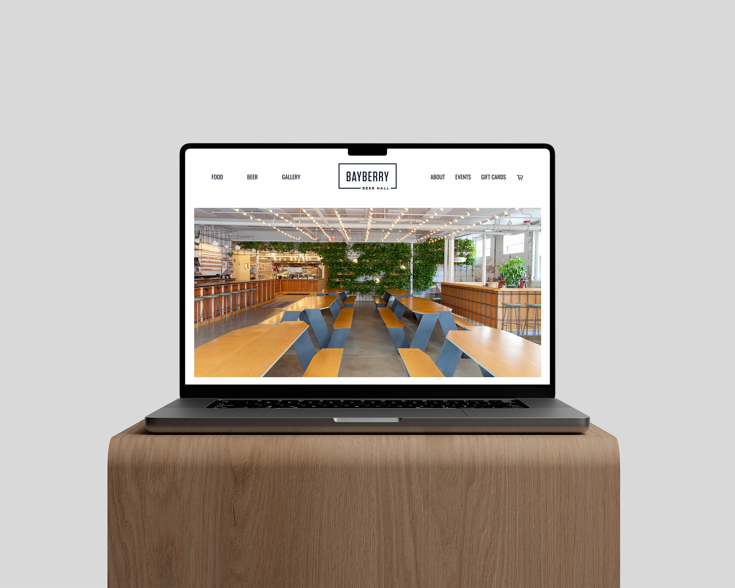
A website was designed in parallel, organized around each of Riverzedge's studios: Graphic Design, Photography, Videography and Editing, Silk Screen Printing, and Public Works spanning murals, installations, and community-facing projects. Strong imagery, a moody but upbeat tone, smooth transitions, and clean layout work gave the organization a digital presence worth pointing people toward. Caol established the visual direction and initial design before the project was passed forward for completion.
The site was designed to speak to several audiences at once. Prospective clients could get a clear picture of what each studio offered. Young people interested in getting involved had a place that felt energetic and welcoming rather than institutional. Donors could see the full scope of what Riverzedge was actually doing in the community. The identity system and the website worked together to make sure every one of those audiences landed somewhere that felt considered.
The rebrand landed with real impact. It gave Riverzedge a new confidence in how the organization presented itself, strengthening promotional materials, funding efforts, and the organization's ability to attract new designers and clients to the program. It looked, finally, like the kind of place it had always been.

A modernized Brand Identity System and Website Design gave Riverzedge Arts the visual credibility to match its creative output, strengthening funding materials, attracting new talent and clients, and giving the organization the confidence to show up fully in the world.


Whether you’re pitching to investors or sharing impact with donors, intentional design helps you be seen, heard, and supported.