Joe Roch had spent years building a reputation as an associate broker at Residential Properties Ltd. on deep local knowledge, an obsessive responsiveness his clients remembered long after closing, and a love of Rhode Island's historic housing stock. What he needed was a visual identity that reflected all of it. Caol built a complete Brand Identity system anchored in a deep navy and electric cyan palette, a clean namemark designed to command attention across every surface, and a secondary monogram for the places the full name didn't need to lead. "Here to Help," something Joe had always said to clients, was woven through signage, print materials, and a fully modular email template system built to flex with every send.
Joe Roch is not a typical realtor. A third-generation appraiser and associate broker at Residential Properties Ltd., Joe built his practice around a love of Rhode Island's historic properties and a client-first approach that had earned him a loyal following well before he had a brand to match it. He came to Caol wanting something more personal than what the agency environment offered. A visual identity that felt like him, not a company headshot on a generic template.
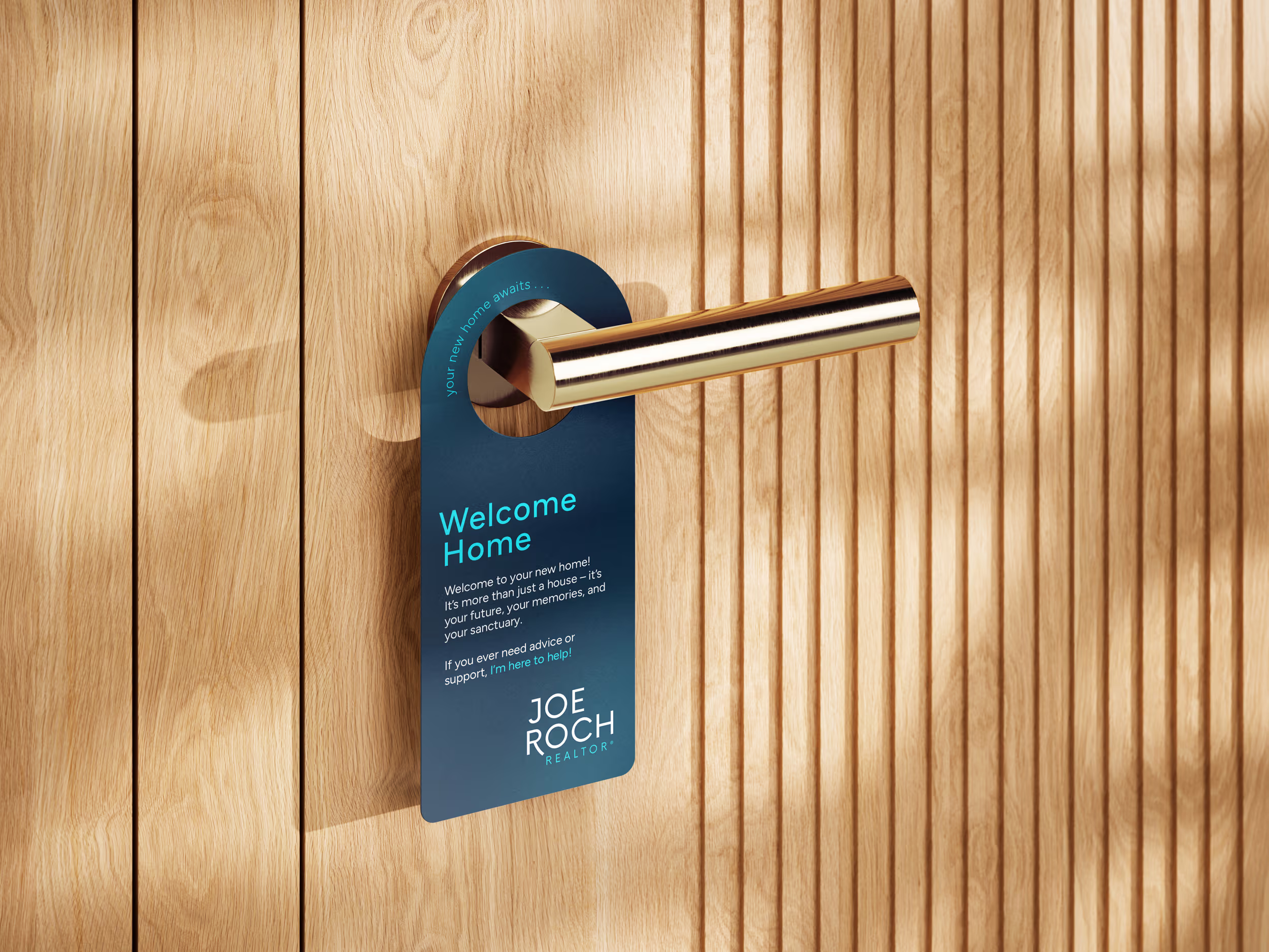
Caol developed an identity centered on a clean namemark set in Now, a geometric sans serif by type designer Alfredo Marco Pradil, known for custom typeface work spanning Alienware for Dell and campaigns for Rihanna. Low contrast and precise with just enough character to stay warm, Now gives his namemark presence across all touchpoints, looking as professional and tidy as the spaces he showcases. A secondary monogram mark, the "JR" initials set as a standalone emblem, gave Joe a personal signature that could show up fully in the places the namemark couldn't, profile pictures, email headers, business cards, anywhere the identity needed to feel intentional without the full name leading the way.
The palette came from a specific place. Joe wanted something modern and clean but rooted — colors that carried the weight of old Rhode Island money without feeling stiff or dated. A deep navy nods to that heritage, Berkshire-adjacent in its authority, while a vivid electric cyan cuts through with the kind of eccentric personality that separates Joe from every other agent in the market. Together they make the system unmistakable wherever it shows up.
The detail that made the whole thing land was the tagline. Joe mentioned in conversation that he always told clients the same thing: "Here to Help." Caol built it into the brand. Set in cyan and tracking cleanly across the bottom of signage, threaded through email footers and print materials throughout, the line became a brand promise rather than a throwaway phrase. A buyer sees it on a yard sign in the morning and reads it again in their inbox that afternoon.
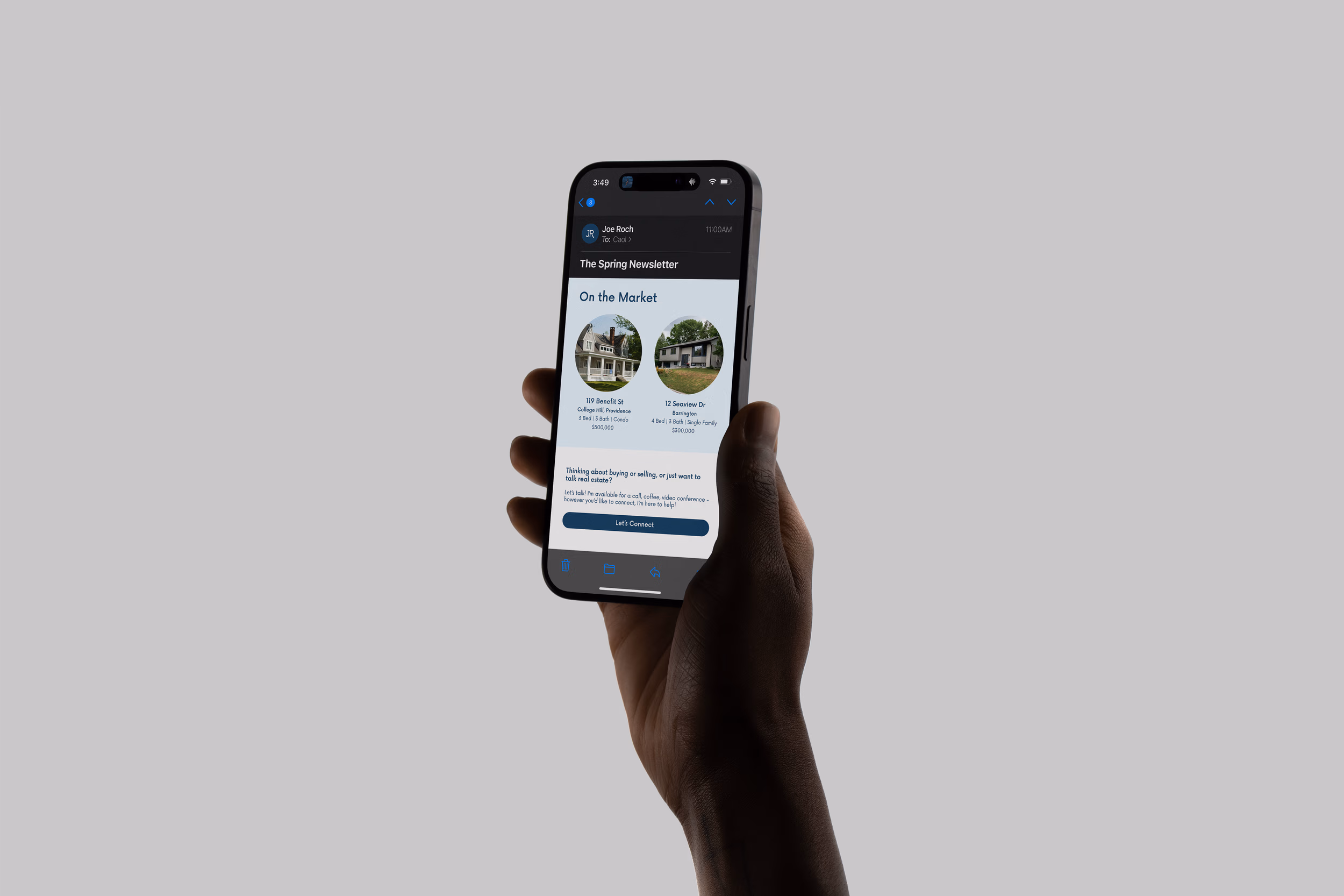
The email template system was built for real use. Fully modular, with swappable sections and color treatment variations drawn directly from the brand palette, the templates gave Joe a polished communication tool he could update himself without breaking anything. Every send looked intentional. Every send looked like the same person who designed the yard sign had designed the email. Because they had.
Joe's reception of his new brand system was positive, no notes. The clean namemark, with its swooping R, and the inclusion of his personal tagline brought everything together. He felt it reflected how he worked with clients, a true representation of what people could expect the moment they reached out. In a state so small that inventory stays perpetually tight and the same buyers keep circling the same properties, reputation travels fast and first impressions travel faster. Having it all working as a visual system gave his voice exactly the competitive edge it deserved.
A complete Brand Identity system with "Here to Help" woven through every touchpoint, from signage to a fully modular email template series that drove real subscriber growth, gave a third-generation Rhode Island Realtor the personal visual presence his practice had always deserved.
Personal brands, portfolios, and creative projects deserve thoughtful design, even if you’re a team of one.